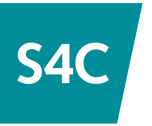
Main identity
In December 2013 Sugar Creative Studio responded to an open call for tenders to undertake a brand refresh project for S4C. We were delighted to be chosen based on our track record and the concepts we put forward in the tender.
The objective from the outset was for the successful company to work with the internal team at S4C to guide them to a point where the concept could be handed over for implementation and disseminated throughout the organisation for adoption with a view to launching in the Spring of 2014. This concept would have to work effectively when implemented on S4C’s website, and all digital platforms, on all marketing and printed media as well as on the channel itself.
The tender set out three areas which the refresh needed to cover; the main identity, transmission information and on screen menus and channel idents.
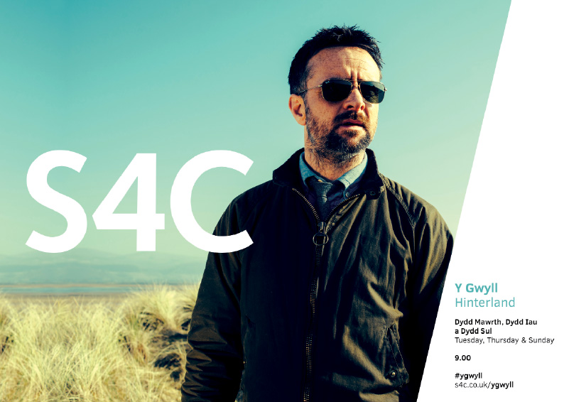
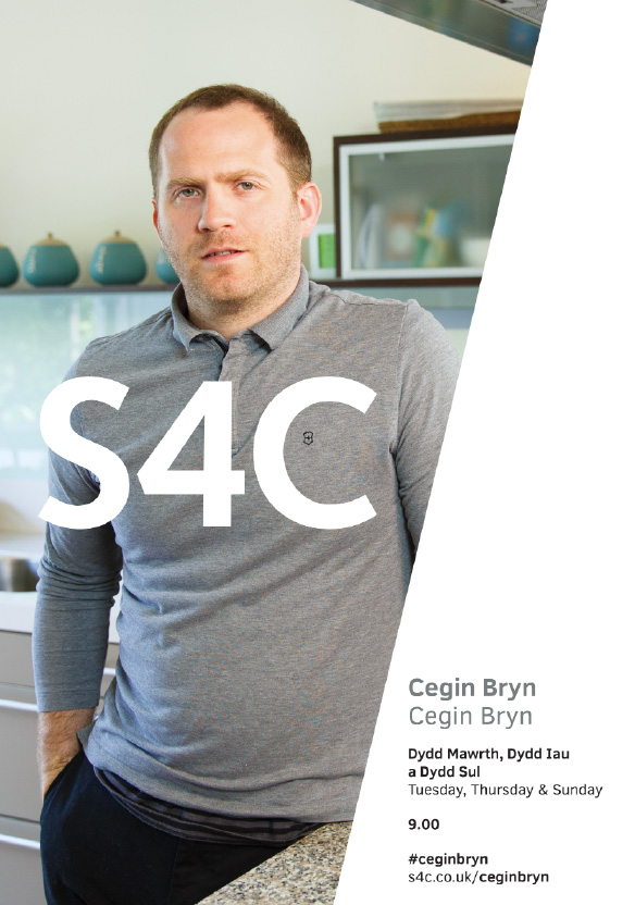
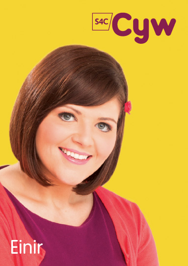
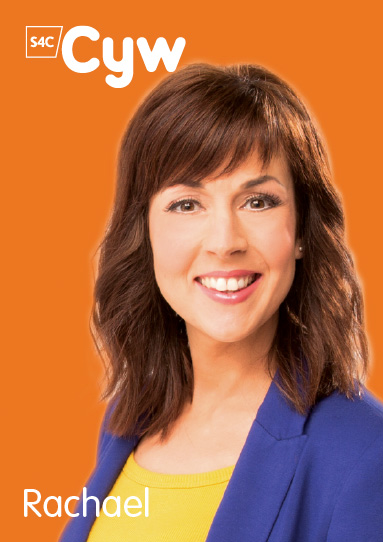
Posters
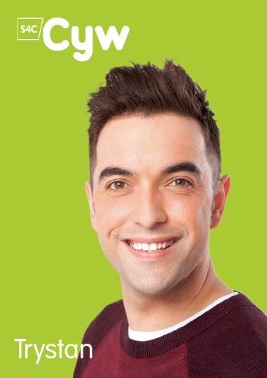
Cyw identity
TX information, menus & break bumpers
Our process


Rationale
1. The main identity
From the very start we knew that this project would be unlike any other branding project undertaken at Sugar Creative Studio. We were being asked to take the project to a certain point and then hand it over.
This meant that we had to have a strong grounding to our concept, something that could be communicated quickly, understood by the masses and flexible enough to be displayed across the many media streams that S4C outputs.
The process we took to understand the brief, pick apart the brand values and mission was a slow and exhaustive one, but one in which we found our inspiration.
The answer seemed to rise out of the words provided in the tender. S4C wanted to rejuvenate its visual brand identity in order to position the Channel as current, relevant and innovative and more accurately reflect our values, mission and vision for the future.
They wanted to show a viewer (or potential viewer) that the programme they were watching/seeing advertised was clearly their channel.
We needed to establish a context and then deliver the content. It was this sequence of context/content that then was to drive everything that was to come after, a benchmark from which we could test all possible output variation against. The identity then needed to reflect the ‘context’ part of the concept allowing the programme information (for the most part) to be clearly defined as the ‘content’.
Dan Clemo (Managing Partner at Sugar Creative Studio) noted “The identity needed to open a way for the content to be delivered. The shape we created was agonisingly poured over again and again until we hit the idea of making the shape a particular angle - confident, bold, recognisable and creating a connection with the viewer.”.
Jason Veal (Technical Director and Partner) added “We needed a device that could become synonymous with S4C so that when the name was taken away, you’d still recognise the shape as S4C”.
High up in our priority list also came the addition of the S4C logo mark to Cyw and Stwnsh to further strengthen the relationship these two brands had with the mother brand.
2. Transmission information and on screen menus
“Having the logo mark as a static object is one thing, making it interact with other elements on screen is another” continued Mr Clemo, “But, we knew that our concept was robust enough to act as an animated element, in fact in our testing it became something quite special”.
Our goal was to put the identity to use on transmission, allow it space to act as channel bug in the top corner of the screen but then to ‘wake it up’ at different points during a programme to deliver further information like ‘Subtitle’ notifications, Twitter hashtags etc.
Similarly the idea of splitting up the screen with the new device and delivering programme information for ‘now and next’ features only went to reinforce the content/context high concept.
3. Channel idents
The channel idents needed to be a statement of S4C’s commitment to Welsh language programming, act as a breathing space between items and invite the viewer in to the next programme. Through consultation with the internal team, the ‘context/content’ theme was taken onboard and the idents planned, filmed and edited with a focus on establishing the context element; being the viewer - the people of Wales and taking a snapshot of diverse lifestyles and then the content; being the output from S4C.
Speaking regarding an on-location shoot, Dan Clemo said, “It was a real pleasure to be invited to see the idents being shot, just the dedication and enthusiasm of the S4C team for this new visual direction was so evident.”
The future
The project was delivered and handed over for implementation and interpretation by the internal team in February/March 2014, for the mammoth task of changing everything over to the new identity.
This interpretation work would involve integration of the brand across on air, off air promotional material, digital media and internal communication systems. All completed by their in-house digital and design teams.
For more information, contact Dan Clemo:
Sugar Creative Studio
3 Cwrt Y Parc,
Llanishen,
Cardiff.
CF14 5GH
029 2000 6776
info@sugarcs.com
@sugarcreative
www.sugarcs.com